PolicyLab – Children’s Hospital of Philadelphia
Unified branding and better user journeys for a pediatric health research leader
OVERVIEW
PolicyLab — a division of the world-renowned Children’s Hospital of Philadelphia (CHOP) — needed web upgrades that integrate new branding and smooth user paths through a growing body of health and legislative content.
PAIN POINTS & CHALLENGES
PolicyLab’s online presence needed a variety of upgrades to reflect its status as an esteemed division of one of the largest pediatric research institutes in the country.
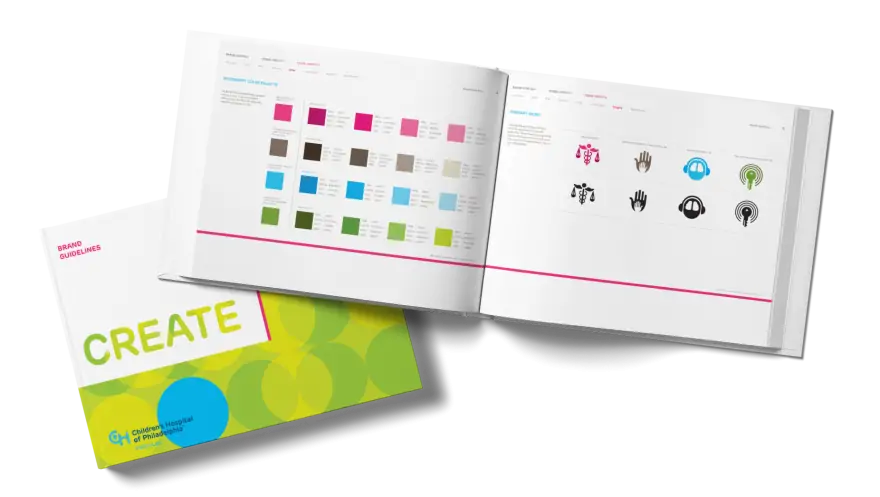
They were seeking an agency partner to explore and apply newly updated CHOP brand guidelines across complex digital applications while maintaining PolicyLab’s unique identity.
Bounce rates were high because of confusing navigation — users needed an easy and intuitive way to explore their expanding body of content.
PolicyLab’s deep body of research and policy recommendations span city-level healthcare interventions for youth and families, designs for statewide home visiting and child welfare programs, federal pandemic response plans & more.
SOLUTIONS: Strategy Meets Creativity
Discovery
We dove into the client’s existing site direction, brand guidelines, web framework, user experience, and content management approach. Our findings guided us in creating a new Drupal-based site that represented a massive front-end overhaul in addition to some minor but meaningful back-end adjustments.

Visual Design
We created a variety of sophisticated visual solutions that seamlessly integrated the client’s new logos, patterns, and iconography and positioned PolicyLab as a unique but related part of the CHOP umbrella brand.
User Experience
We consolidated the sitemap and restructured content so users could find relevant information without too much effort. Major navigation and information architecture corrections began with expanding the main site menu from three categories to five to align with the organization’s newly defined strategic core areas.
We made highest-priority research categories easier to find; created better links between related content like projects, blog posts, and related team members; and redesigned secondary menus that make the connections between various bodies of content more meaningful and intuitive.
Since Publications, Blog & Profile pages humanize PolicyLab and position younger researchers as experts — important for boosting recruiting and community interest — we gave these pages more prominence and added filters by topic, tool, and/or specialty option to increase visibility to audiences that include the media. To allow the client to better view and manage user activity, we also added analytics and tracking to publication and policy tool downloads.


