Digital First — Rethinking the College Viewbook
Over the years, we have worked with many colleges and universities on a wide array of marketing materials, and we have found one common denominator when it comes to traditional student viewbooks: They tend to look and sound the same.
The formulaic approach that so many colleges take to this printed brochure geared towards incoming students generally includes uninspired photography — students walking down a leaf-strewn campus path, laughing over a latte, and sitting studiously in a library — as well as messaging and design selections that are very similar in tone and appearance. In the end, these critical marketing pieces tend to fall short of their goal of differentiating schools among a sea of competitors in the eyes of college-bound high school seniors who are thinking about how to match their individual needs up to a prospective college in one of life’s most important and daunting decisions.
We encourage our higher education clients to take a more creative tack informed by our research into how students want and need to experience content in order to make their college application decisions. Here is our advice for those looking to do something truly different and memorable.
Go Digital First
We’ve found that an experiential, user-focused digital approach resonates with this young, technology-savvy audience. Prospective students typically seek to experience a quick hit of introductory-level college information on their smartphones before doing further research, and a cutting-edge digital viewbook provides an ideal opportunity to provide this instant gratification and establish a quick and effective emotional connection.


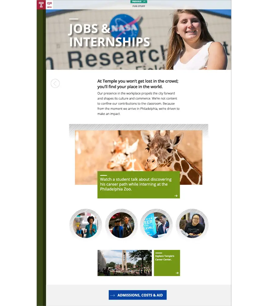
Next Stop, which represents a bold commitment to an all-digital viewbook format for Temple University, serves up rich content designed to guide visitors through the decision-making process while incorporating some of the latest developments in design technology.
Understand Audience Behavior
It’s important to know how to market to this age group through a deep understanding of their online search behavior, their preferred terminology and technology, as well as which features will trigger their desire to explore further. When we worked with Temple University to create their Next Stop Digital Viewbook, we extensively studied the search and navigation patterns of students in this age group — with ongoing user interface testing throughout the project’s entire first year that led to design and experiential changes that boosted conversion rates for the University.

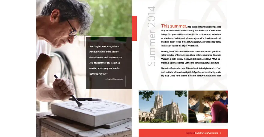
A print brochure for Bryn Athyn College provides a detailed and realistic look at the hands-on decorative building arts classes — and the master craftsmen who teach them — in their summer workshop program.
A print brochure for Bryn Athyn College provides a detailed and realistic look at the hands-on decorative building arts classes — and the master craftsmen who teach them — in their summer workshop program.
Leverage Print With Panache
Print viewbooks will continue to play an important role in supplementing their digital counterparts, particularly when students and their parents are ready to take in detailed decision-making information — and, of course, print offers many opportunities for infusing creativity and originality through innovative design choices, original photography, bold typography, and fresh language. The key is to focus on the reasons why students actually choose any given institution and figuring out how to convey that through clear and concise messaging and visuals, keeping in mind that virtually every college will have pictures of happy students.
“Listening to our clients without preconceived notions and being able to envision what makes them different is key when it comes to developing solutions that represent each institution’s unique identity through design,” explains Eastern Standard Creative Director David Wolf, who has worked on a variety of print viewbooks at some of the top industry design firms throughout his career.
Make Authenticity a Priority
Creating compelling and honest storytelling content — and resisting the temptation to sound artificially “cool” — will help you create an authentic communication tool that prospective students will buy into. Incorporating actual testimonials from students about their decisions and first-person experiences, when appropriate, provides an added dimension of credibility.
“Seventeen-year-olds experience content in their own way. You want to make prospective students able to realistically see themselves at the college, and also provide a fair picture of what the school expects from them, as well. It’s definitely a two-way street.”
— JIM KELLER, EASTERN STANDARD TECHNOLOGY DIRECTOR

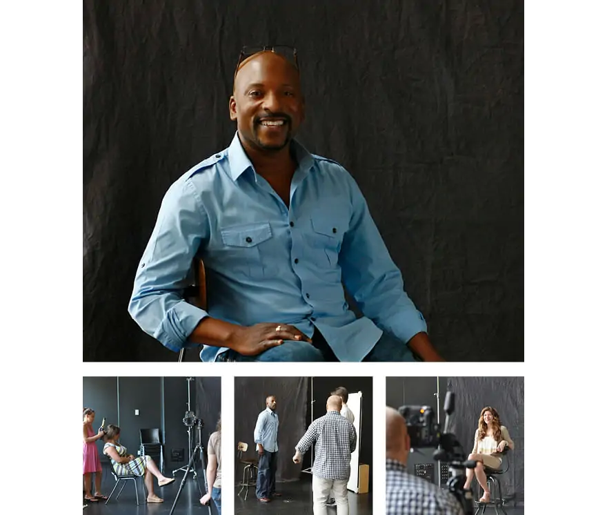
Authentic testimonials and a commissioned photo shoot featuring actual students enrolled in the University of the Arts Professional Institute for Educators set a uniquely personalized tone for this print brochure.
Authentic testimonials and a commissioned photo shoot featuring actual students enrolled in the University of the Arts Professional Institute for Educators set a uniquely personalized tone for this print brochure.


